My Top Five Tips For Making New Construction Look Old
By Lynn Byrne. First, thanks so much to the lovely Emily A. Clark for featuring my home on her blog, hereand here. I am overwhelmed. Thanks to all of you who made such sweet comments and tweets. I truly appreciate it.
Now, for the dirty little secret about my house. While we rebuilt it, we did not restore it. Yes, on the outside, especially from the front, it looks much like the original home.
But absolutely nothing in the rebuild is the same as what the house looked like when we bought it, before the fire. To catch a glimpse of what we were dealing with even before the fire (and to see a bit of the construction process), click here.
Inside, there was no period detail to save or recreate, except for the in-laid floor decoration. It was all stripped out in terrible “remuddles” over the years. And while we installed an inlaid floor pattern during the rebuild, even that went in differently than how it was installed in the original house.
So when building my home, I didn’t recreate what was there before. Rather, I imagined what could have been there when the house was built and created those details for the new house.
Here are my top 5 tips for making new construction look old.
1. STUDY UP
I did a lot of research but there are two books I think are a must have, whether you are adding on to an older home, or starting fresh and hope to build new with character.
The first is A Field Guide to American Houses, by Virginia & Lee McAlester. This book, with its many photos, will help you pinpoint your home’s architectural style. It even has line sketches of exterior detail that you can incorporate in your construction plans to help make your home’s exterior look authentic.
The second book, The Elements of Style, edited by Stephen Calloway and Elizabeth Cromley, is truly a bible. Billed on the cover as a “practical encyclopedia of interior architectural details from 1485 to the present,” it will help you answer all of the myriad questions that come up in construction. How to use it effectively? Identify your house from the Field Guide and then head to the appropriate chapter in Elements.
So, for example, I have a small vestibule just inside my front door (which, of course, did not exist in the old house). When it came time to select flooring, my choice was easy. Elements said that hall floors in homes originally built when mine was built usually were tiled with decorative encaustic tile laid in a geometric pattern. Bam! Guess what I installed.
2. PAY ATTENTION TO THE LIGHTING
If you are trying to make your new construction look old, please, please please stay far away from recessed can light fixtures. Nothing screams “new construction” more. Now, I will admit, when I barred this type of lighting in my house, my architect and builder thought I was crazy, especially in the kitchen. But I was paying them so I prevailed. And everyone agrees that it made all the difference. Check out my solution for the kitchen lighting.
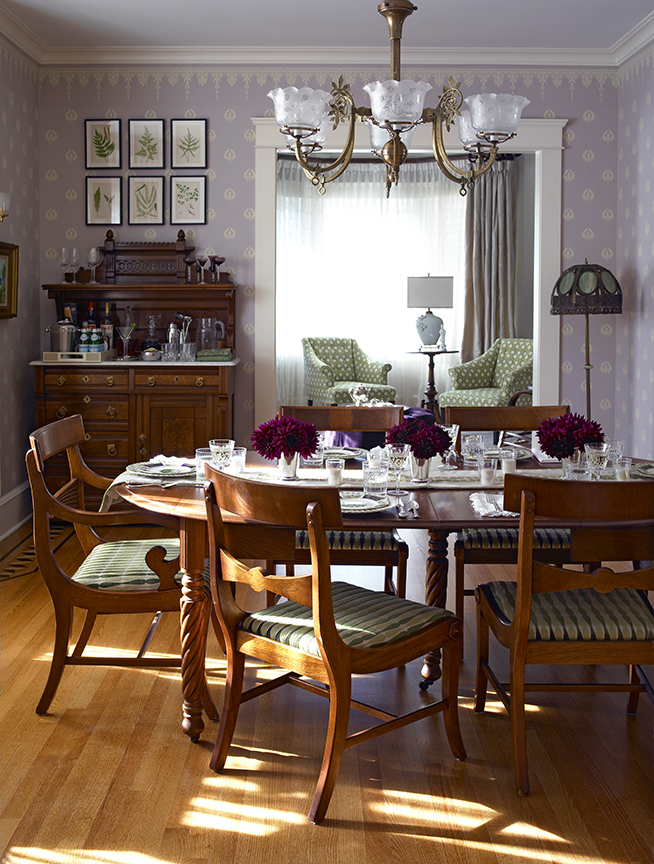
Following from there, choose light fixtures based on the architectural style of you house. We all know it: lighting has a huge impact on atmosphere. In some cases, I sprung for the real deal: in my dining room, the chandelier is a period antique.
Often, however, I ordered new fixtures from companies that specialize in architectural lighting likeRejuvenation and Brass Light Gallery.
Another tip, I made these new fixtures unique by purchasing period, antique shades on eBay. These can be had very inexpensively. You need only pay attention to the shade fitter size, and both Rejuv. and Brass Light will tell you what size each fixture requires. Here is a close-up of one of the wall sconces in my front parlor: the shades are Victorian, the metal fixture is new.
3. LOOK TO HISTORIC HOUSES FOR INSPIRATION
Yep, I have said that before (just this week even). I practice what I preach. My husband’s office was inspired by the study in Teddy Roosevelt’s famed Shingle Victorian located in Long Island’s Oyster Bay (Larry is a big TR fan). No it is not a replica, but it does have the same feel. No animal heads ’cause the decorator (ahem) is not into taxidermy, but I did include the fish as an homage to my hub’s other favorite hobby.
4. WHILE I AM ALL FOR THE “MIX”, INCLUDING A FEW ANTIQUES FROM THE TIME PERIOD YOU ARE TRYING TO EVOKE GOES A LONG WAY
That is why I chose a Victorian period hall tree for my entry way. You get the message from the get go.
5. LET WALL COLOR OR WALLPAPER HELP SET THE MOOD
Color is so subjective. Still, I think that choosing wall colors from your favorite paint company’s historical palette, does make a difference in how a space feels. So does wallpaper based on historical designs. I have a love affair with Farrow & Ball but I also used historical colors from Ben Moore and Sherwin Williams. All of my wallpapers are newly made but the designs are from the turn of the last century. (I am happy to share sources, in response to comments.)
Check out a favorite room in my house: the powder room. The wainscot is a Victorian wall treatment known as lincrusta that I glazed (sourcing this required a bit of digging). Above that is a wallpaper named Honeybee from America’s first woman interior designer. No, its not by Elsie de Wolfe, but rather by a woman named Candace Wheeler. She worked with Louis Comfort Tiffany. I promise a future post on her.
I hope you find these tips helpful. HAPPY BUILDING!
Photo of Roosevelt’s study from NYPL Digital Gallery. Room shots by Ellen McDermott.


