Why Is This Year's Kips Bay Show House So Special?
Interior design by Ken Fulk for the 45th Kips Bay Show House
It's all the buzz. This year's Kips Bay Show House is widely praised as one of the best in years. But what makes the 45th Kips Bay Show House so special? Did a new trend emerge? Was there a conceptual room that reverberated ? What precisely did the designers do different this year??
Classicism
Well, yes, there is a prevailing trend.
It permeates throughout the 45th Kips Bay Show House elevating all of the designs to the highest level, but it's not new. Rather, room and after room rocks because the designers followed the principals of solid, classic design. Connoisseurship ruled every decision.
As design doyenne Bunny Williams says, "You're giving people what they want--but it's the best version of what they want." Designers looked to design history for inspiration. They filled their rooms with museum quality furniture and blue chip art. And they employed artisans to recreate decorative embellishments in the finest traditions in decorative arts.
I haven't found a name for this trend so I am going to call it classicism. I am all for it.
Who needs maximalism, minimalism, traditionalism and the like, if you go with the style you prefer but choose the best you can afford? And there isn't a better guide than looking at great rooms and architecture when it comes to arranging your stuff in a livable way.
Let's take a look at how it was done.
Design History
Richard Mishaan
Interior design by Richard Mishaan for the 45th Kips Bay Show House
Richard Mishaan's living room was filled with rich layers of pattern and objects. Like several other designers, he said he wanted his room to look collected over time. Wallpaper inspired by Instanbul's Topkapi Palace is the show stopper.
The Privy Chamber of Murat III in Instanbul's Topkapi Palace with its incredible Iznik tiles that date from the 16th century
Princess Lee Radziwill with daughter Anna Christina in the Turquerie room of their London house. Interior designed by Renzo Mongiardino
Clearly Mishaan also had a look at Renzo Mongiardino's acclaimed room for Lee Radziwill.
Nick Olsen
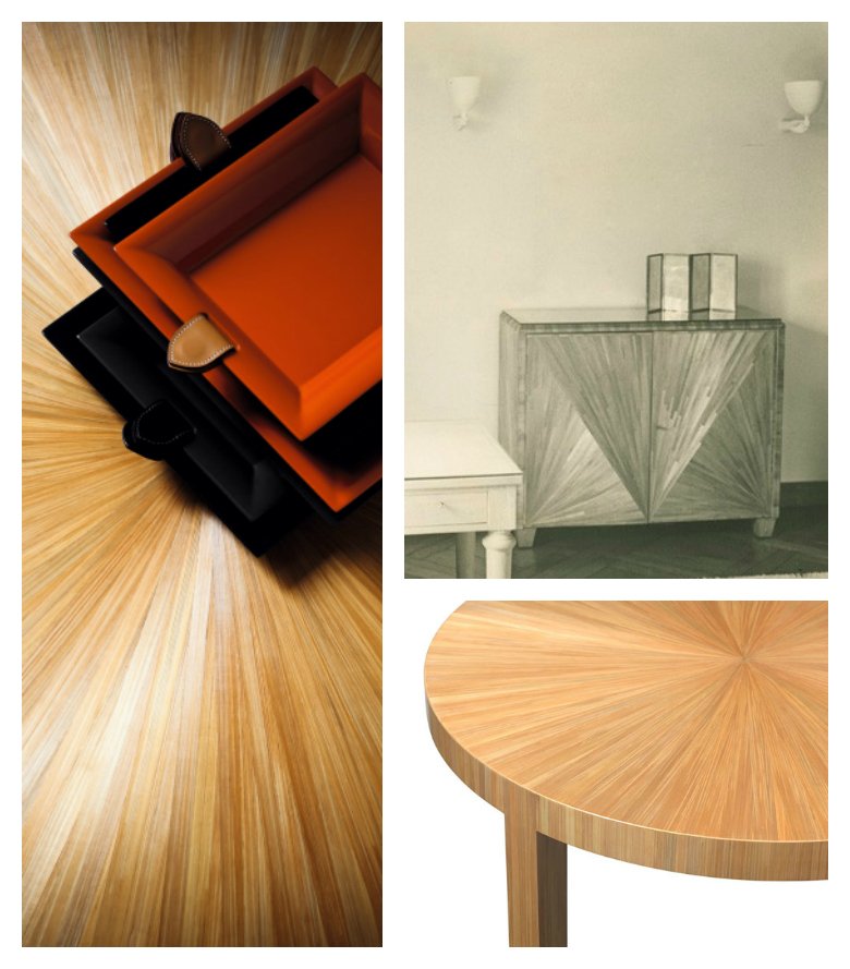
Designer Nick Olsen looked to the French Art Deco period and one of it's leading designers, Jean-Michel Frank for inspiration for his space. He chose Frank's signature straw marquetry to sheath his room, using a wallpaper by Maya Romanoff.
Interior design by Nick Olsen for the Kips Bay Show House
Jean-Michel Frank's straw marquetry
Janice Parker
Landscape design by Janice Parker for the 45th Kips Bay Show House
Landscape architect Janice Parker created an Asian outdoor environment, complete with a moon gate, that echoed elements of Tony Duquette's fanciful and iconic garden at Dawnridge.
Moongate in the landscape design by Janice Parker for the 45th Kips Bay Show House
Like Dawnridge, she used similar textures and palette of verdigris and red, lining her space with lush plantings and bamboo.
Decorative Arts
Museum Quality Furniture
Interior design by Neal Beckstedt for the 45th Kips Bay Show House, chair by Pierre Jeanneret
The 45th Kips Bay Show House is so filled with museum quality furnishings that it is impossible to show them all. Let's keep it simple and look at just two of my favorite chairs. I love the Pierre Jeanneret chair, seen above, in Neal Beckstedt's room. In addition, Rob Stilin includes a beauty by Mattia Bonetti--a current design darling who had a solo exhibition at Collective Design this year. It has an especially sexy back.
Interior design by Rob Stilin for the 45th Kips Bay Show House. Chair in foreground by Mattia Bonetti
Handpainted Wallpaper
No discussion of decorative arts at this year's Kips Bay Show House is complete without mentioning the wallpaper. I have never seen better. The handiwork is exquisite.
Interior design by Ken Fulk for the 45th Kips Bay Show House. Wallpaper by de Gournay. Billy Baldwin etagere
Ken Fulk commissioned venerable firm de Gournay to transform its traditional chinoiserie wallpaper to include a magical menagerie of animals that escaped from a zoo.
Similarly, Jonathan Savage asked MJ Atelier to created a modern chinoiserie wallpaper filled with wildlife and flora from his home state of Tennessee. The designs are hand sculpted with plaster using a pastry bag.
Interior design by Jonathan Savage. Wallpaper by MJ Atelier.
Interior design by John Savage. Wallpaper by M J Atelier .
What is old is new again.
Fine Art
Like the museum quality furniture sprinkled throughout the house, the Kips Bay designers carefully curated the art they hung on the walls. Kirsten Kelli's and Rob Stilin's rooms stand out. Both were packed with art.
This angle in Kirsten Kelli's room shows an iconic dot painting by Damien Hirst and part of a lovely blue abstract by Corinne Bizzle.
Kirsten Kelli's room in the 45th Kips Bay Show House shows an iconic dot painting by Damien Hirst and part of a lovely blue abstract by Corinne Bizzle.
I love this abstract in Rob Stilin's space. It's by Dan Colen and it's done in bubble gum!
Interior design by Rob Stilin. Abstract painting by Dan Colen. The letter Q is b Danh Vo.
Conclusion
The Kips Bay Show House is well worth a visit. I simply scratched the surface! It's open through May. If you can't make it, please follow me on Instagram where I will continue to post more pictures.
And, if you are like me, and you like all types of design as long as it is done very well, we now have a name. We are classicists. :-)
Photo credits: All Kips Bay Show House photos by Lynn Byrne, except for Rob Stilin's room which are by Stephen Kent Johnson, and the large Savage Interior Design photo from their website. Topkapi Palace. Lee Radziwill photo by Horst. Frank furniture color photos by Hermes.


